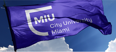
MIU Logo Evolution
Over the years, MIU (City University Miami) has undergone a visual transformation to reflect its growth, modernity, and commitment to global education. Each logo version represents a key milestone in our history, adapting to new design trends while preserving our identity.
1. The Initial Logo: Marconi International University
The first logo represents the stage in which the university was part of the Marconi University Group, reflecting the connection with traditional education by using with classical elements and formal typography. The figure of the Roman Coliseum and the U.S. flag were prominent, representing international influence.
2. First Modernization: Minimalist MIU
In this stage, the visual identity was simplified with a cleaner and more modern logo. A simple typographic style with soft colors was adopted, conveying accessibility and approachability.
3. Innovation and Digital Transformation
MIU begins a new period as part of the PROEDUCA group, during which, in our efforts to adapt to the digital world, we introduced a more geometric and conceptual version of the logo. The typography acquired a more avant-garde style, with curved and modular shapes that represent innovation and connectivity.
4. Contemporary Identity: MIU City University Miami
In the most recent version, we consolidated our identity with a balanced combination of graphic and typographic elements. The new design highlights our presence in Miami and reinforces our global focus with a fresh and professional visual style.
With each evolution, MIU has reaffirmed its commitment to academic excellence, innovation, and international education. Our logo continues to represent our values and our mission of preparing professionals for the future.